One of my classes is about design and the instructor asks us to think visually. Another asks us to be critical of stories we read. These aren’t new concepts to me, of course, after 14 years as a print reporter.
Here’s what I mean, and the ideas I now want to try in my classes.
In looking just at today’s coverage of the current number of flu cases in the United States (notice I didn’t say flu “outbreak” or “epidemic”) I found a variety of ways that the story is being covered. While I might have noticed these different approaches in the past, I might not have thought about the distinction, or about how I can teach my students to consider different approaches to the same news.
For example, here’s the traditional AP report on the number of cases. It’s solid, straightforward stuff that you would teach beginning and even advanced reporters to aim for.
By MIKE STOBBE, AP Medical Writer
NEW YORK — Flu is now widespread in all but three states as the nation grapples with an earlier-than-normal season. But there was one bit of good news Friday: The number of hard-hit areas declined.
The flu season in the U.S. got under way a month early, in December, driven by a strain that tends to make people sicker. That led to worries that it might be a bad season, following one of the mildest flu seasons in recent memory.
Then there’s what I’m going to call the visual or #vizdata story that Google put together on its flu trends page. I think the visual nature of the presentation of the flu data this year compared to years past lead to increased coverage in both the mainstream and social media, but perhaps that’s a topic for another day.
At the same time, my increased focus on critical thinking as part of the classes I’m taking made me think more about the data. As I looked for the Google methodology, I found this disclaimer about flu map:
We have found a close relationship between how many people search for flu-related topics and how many people actually have flu symptoms. Of course, not every person who searches for “flu” is actually sick, but a pattern emerges when all the flu-related search queries are added together. We compared our query counts with traditional flu surveillance systems and found that many search queries tend to be popular exactly when flu season is happening. By counting how often we see these search queries, we can estimate how much flu is circulating in different countries and regions around the world. Our results have been published in the journal Nature.
For the record, I don’t doubt the super-smart folks at Google. But I do wonder how close the number of people who search for flu information really is to the number who actually are in bed staring at the ceiling in misery. What about those sick people without internet access? What about health reporters who aren’t ill but just looking for some current info? Those are things to think about and to have your students consider.
(A side topic for class discussion or assignment might look at the use of the words epidemic, outbreak, etc and their true definitions.)
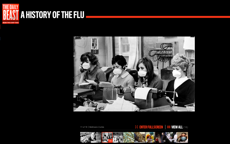
Another approach to the flu story I found today was the historical photographic coverage of the flu. I enjoyed the coverage from thedailybeast.com, which tells the story relying on pictures.
Click here for the whole gallery.
These are all different, but all valid approaches to the same story. And they all use different skills modern journalism students need to know.
(Speaking of new skills, I curated this Storify page as I looked at what social media had to say about the flu.) Of course, Storify is another tool I love for students to learn, because I think it has some great applications.
To summarize, I’m now thinking that one exercise I might try this semester is having students first look for different ways the same story has been covered online and talk about the strengths and weaknesses of each. They could even do their own Storify pages on the topic. Then, I might ask them each to outline the different ways they would cover the same story such as a city council meeting, perhaps.) Later, I would have them present and compare their ideas to see all the different ideas on approaching story telling. I’ll let you know if I try this.
